
I’ve just returned from a terrific engagement with my friend and colleague Stephen Few at the World Health Organization (WHO) in Geneva, Switzerland.
We spent four days with the group, two days teaching best practices for the visual display of data using tables and graphs, and two days meeting one on one with small groups advising them about the ways in which they could improve their specific reports. And, of course, we learned about the important work the organization is doing throughout the world to eradicate disease and suffering. (The entire time I kept thinking “somebody pinch me…this place is very cool.”)
Under the heading of “no matter where you go, there you are,” I also learned about the challenges the WHO team faces to capture and present the data in a clear and compelling manner for a myriad of stakeholders. I found many familiar themes — good and important work, mounds of data (some good, some not so good) and the universal challenge of finding the most appropriate way to present the truth in the data without alienating any one group.
Sound familiar? Yup, they have similar problems to us — here are four examples:
1. Data Quality and Documentation — At times the data the WHO team receives is incomplete and captured using the most remedial of tools. This state of affairs is compounded with the task of understanding how the data is defined and harmonizing it across reporting initiatives — what is the intent and purpose of the data collected and is it consistent?
2. “Database Hugging Disorder” — In spite of efforts to develop and make available simple databases with user-friendly interfaces for data entry, many groups throughout the world hold on tightly to the old and often outdated methods and databases they are familiar with. The WHO team of analysts’ refers to this as the “DHD” — Database Hugging Disorder. (To date there is no known cure, only a prayer that the end will come swiftly.)
3. The “So What” Factor — The group reports lots and lots of facts and figures — but they often struggle to deliver the data in a way that helps their audiences understand the “so what” of it all. “So what” are the opportunities to improve? “So what” is the return on investment for donors? “So what?”
4. Reporting Sensitivities — I am very familiar with physicians’ and hospitals’ sensitivity to having their data reported and compared to other groups, but I had never thought about it with regard to individual countries. But it makes total sense that no country wants to be singled out as being last or “less than” another country.
Okay, those are the problems. Here’s how the WHO is working to address them. And guess what, many of their solutions can work for us too:
1. Data Quality and Documentation — Imagine gathering information from countries all over the world with highly variable resources and access to technology — daunting.
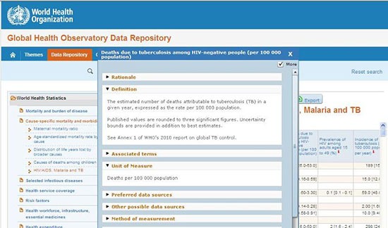
But in spite of these challenges the WHO team has created a fantastic ancillary tool to help them with the data that they do capture (which amazingly, is significant) — The WHO Indicator and Measurement Registry.
I cannot tell you how many times I see groups create duplicate variables because there is no way for people to easily find out what data is already being captured and exists in their databases and data warehouses. Or, how many times reports are nowhere near as powerful as they should be because the people requesting or creating the reports have no way of knowing what data is available to them.
A documentation system and a commitment to maintaining it is not a “nice to have.” It is a must have in the world of healthcare data. The WHO has got this one exactly right.
Check out the following example below or click here to try it out for yourself.
2. The “So What Factor”— One of the reports that the WHO tuberculosis group asked for help with reported a count by country and disease type of patients who were treated at an inpatient versus outpatient facility.
Working with the team we suggested that the “so what factor” could potentially be answered by adding trended data about where treatments are being delivered over time, along with data about the availability of inpatient versus outpatient services in each country over time. Adding the outcomes of care and the cost of care in each setting can also increase the “so what factor.”
Now the type of facilities that may be needed to improve the delivery and outcomes of TB care in a cost effective manner can begin to be examined…the TB group has their “so what factor” for this report.
3. Reporting Sensitivities — It is possible to report the truth while being sensitive to the groups and individuals you are reporting about. For the WHO this often means that instead of ranking results from best to worst, the data is listed alphabetically by country. Although it makes it a bit tougher to see where the opportunities are, the data is reported and available — nothing is hidden.
For your group, it may be advisable to first present the data in a confidential setting and de-identify the name of individuals or groups. Present the data in a manner that will compel people to act — not bully or humiliate them.
And so, as Confucius says: “no matter where you go – there you are.” (No kidding…. Confucius, China’s most famous teacher, philosopher, and political theorist who lived from 551 to 479 BC really did say it.) But the true beauty of this fact is that our shared experiences are also our shared opportunities to learn from one another and for us to collectively manage and report our data more efficiently and effectively.
Leave a Reply