
This fall I have been attending a course called “Right Grammar Right Now.” To some of you the reason why I am doing this may be painfully obvious — thank you for reading anyway.
On the first night of class — you know, the one where everyone has to say their name and why they are there — I found that several of us had the same reason…it seems that we have lost our confidence.
We are no longer sure if it is the rest of the world that speaks and writes incorrectly, or if it is us. We want someone to remind us of the rules of English grammar and help us to regain our confidence.
The teacher, “Grammar Lady,” is fantastic and no nonsense. Back to the third grade and the basics for us…we’re all diagramming sentences.
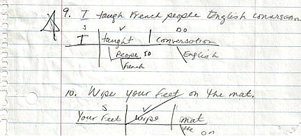
In full disclosure I will tell you that on my first try I got 9 out of 10 partially right (in other words, they were wrong) and it wasn’t until the last sentence that I finally got the hang of it (third grade was a long time ago in a galaxy far, far away). And as if 9 out of 10 incorrect answers wasn’t bruising enough to my ego, I had to face the hard reality that the gentleman sitting next to me, for whom English is a second language, diagrammed more sentences correctly than I did.
But here is the thing — having to go back to the basics and remember what a sentence does, what the parts of a sentence are and how to correctly structure a sentence has helped me immensely. I realize that in order for me to get my ideas across in my articles, newsletters, blog and manifestos — I need to understand the building blocks of writing.
It also dawned on me (as I was sweating over adjectives and adverbs), that “Grammar Lady” is doing for me exactly what I do for my clients — teaching the correct use of a language. She teaches English and I teach the language of healthcare data analysis and display.
And just like there are rules and best practices that we build upon when we write, there are rules and best practices for the display of data — rules and practices that enable us to show the message buried in our healthcare data in a correct, clear and compelling manner.
For example, a table displays and details data in an organized manner and allows the viewer to look up individual values, compare individual values, show precise values and compare the details of multiple units of quantitative measures.
A graph on the other hand, allows people to see and understand the messages in data “at a glance.” A graph shows the shape of the values and reveals relationships among multiple values.
And just like there are different arrangements and ordering of words and tools — such as the period, the question mark and the exclamation point that let us know what type of sentence we are reading — there are also different types of graphs, which clearly impart the different types of messages in our data.
For example, when we need to display time series data in order to show the changes in values over time, a line graph is usually the best choice. But if we want to rank data, the best display is most often vertical or horizontal bar charts. The best choice to compare two paired sets of values, or correlations in data, is most often points, and we never use pie charts to display anything lest we show the world that we are completely illiterate.
You know, my family was surprised when I decided to take this class. More specifically my daughter said to my husband, “the Grammar Police is doing what?” To which he replied, “yes the Healthcare Data Chick” has gone back to grammar class 101.
They think they are so funny (and sometimes they are)…but here is the thing…I know enough to know that I can always learn more.
Leave a Reply