
Recently, we have been working with the Urban Indian Health Institute (UIHI). As a Public Health Authority and one of 12 Tribal Epidemiology Centers in the country — and the only one that serves Urban Indian Health Programs nationwide — UIHI’s stated mission is, “Decolonizing data, for Indigenous people, by Indigenous people.” Until recently, I had no idea this organization even existed.
Health Data Viz Consultants Cambria Brown and Lindsay Betzendahl were lead on the UIHI projects, reimagining and redesigning the group’s Community Health Profiles and Diabetes dashboard (not yet released) and designing a new, interactive Covid Data Visualization (pictured below and viewable live on UIHI’s website, here).
Covid visualizations abound for the general population, but this one focuses on American Indian/Alaska Natives (AI/AN). It is beautiful, easy to use, and the story in the data is eye-opening.
Here are a few of the techniques that were used…
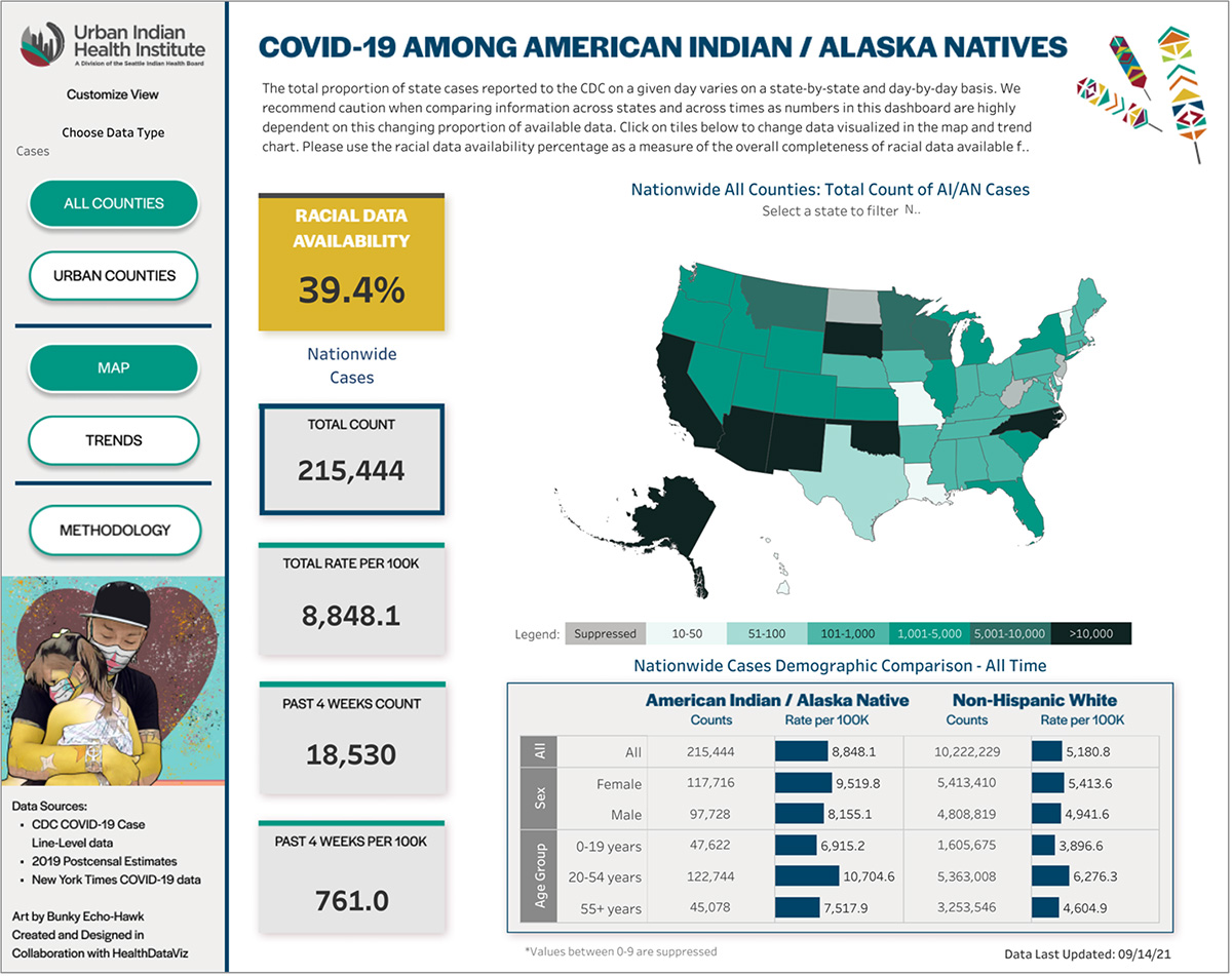
- The use of tiles is a simple way to display key metrics and serves to filter the data displayed on the map (helper text appears when you hover over a tile).
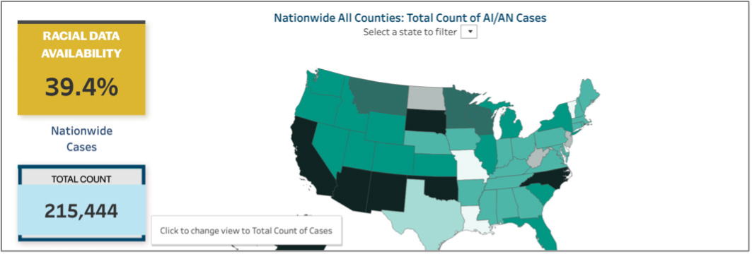
- The tile displaying Racial Data Availability is placed at the top left corner of the visualization, where people tend to look first and colored in a deep gold to grab viewers’ attention.
- Data for a specific state may be selected by a drop-down list placed directly above the map, or by clicking on a state within the map. A sequential gradient is used to display the lowest (least saturated) to the highest (most saturated) data values. The use of black to display the highest rates is a stark reminder of the pandemic’s toll.
- It is important to note that all the labels on the visualization dynamically change to reflect the state selected. Another button placed directly near the map will reset the view back to all states.
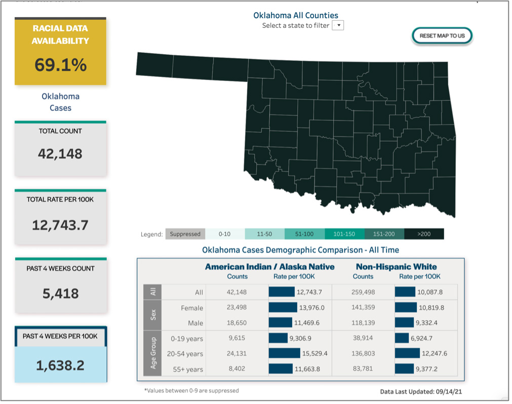
- The use of side-by-side bar charts to compare AI/AN to Non-Hispanic White (NHW) has the advantage of only needing to label each row once, while supporting direct comparison between the two groups.
- Additional functionality is supported by the clearly labeled buttons in the left-hand column, such as replacing the map with a line graph displaying trended data. Note that the drop-down filter persists in the view to allow the viewer to select a specific state’s data.
- When creating any visualization — especially one like this that is integrated into an organization’s website — it is important to use colors, fonts, and a styling that works with any existing logos or branding. The data visualization should feel seamless to the viewer.
Final Thoughts
There are a lot of conversations about health equity lately (all overdue), and it is beautiful displays like this one that will elevate our awareness and help us all to see the opportunities for improvement.
We see, we know, and now we can do better for the health of everyone.
Leave a Reply