It’s not uncommon for me while designing a data visualization to wrestle with two, seemingly, competing priorities: successfully visualize all necessary data elements and charts on the dashboard and minimize the noise so the most important pieces of the data are easy to find.
As Kathy Rowell, HDV Principal and Cofounder, mentions in her post on effectively using icons, using shapes and color to encode meaning can be trickier than it may seem. Should you use the icon on every data point? What if the shape and the color have different meanings? Are you introducing more noise or helping to reduce it? What is the best icon to use anyhow? What about icons with colors and are they accessible? As Kathy would say, “Oh, my aching head.”
I think it’s important to use icons sparingly and with very clear intention. Additionally, if I’m going to add icons with color, then I consider how can I reduce color elsewhere to reduce conflicting visual attention. Let me show you three ways to use indicator icons in Tableau.
Aliasing Boolean Field with Characters
Pre-attentive attributes such as color can assist in quickly drawing attention to certain data points in a chart. For example, if I need to highlight values that are below a target in a bar chart, I could show which values are meeting the target and which are below target by using two colors.
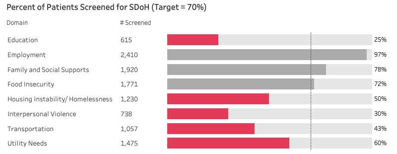
However, this introduces a lot of ink, and you can imagine the amount color that would be added if you had many bar charts in the dashboard.
Instead, I like to use Unicode characters to add a color indicator more subtly to the chart to show which values are not meeting the target. To do this we can use a Boolean calculation (same as you would for the prior example) such as [Measure]<[Target].
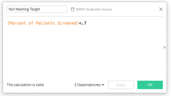
Place this new calculation on rows and then right click on the field to “Edit Aliases”.
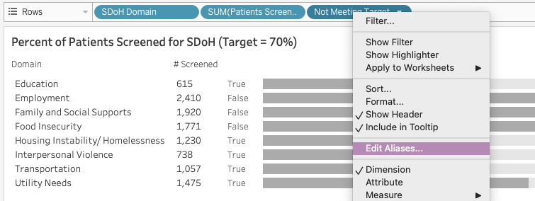
Next, change the True value to a circle and the False value to a blank character. I use the Emoji and Symbols keyboard on my Mac to copy/paste the circle, but you can also find the most common characters here and can copy the blank from here.
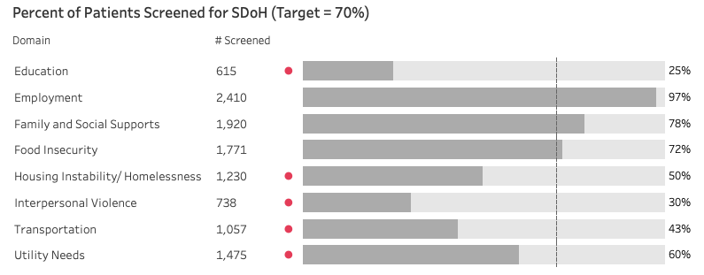
Now you can format the field to a color, such as red, and now only the bars below target will have a small red circle next to them, alerting us to “look here” but not overwhelming the dashboard. View the full dashboard on our Tableau Public page.
Colored Indicator Bars
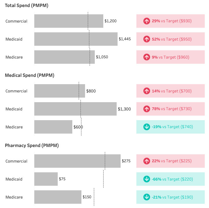
Sometimes it’s not enough to just draw attention to values that need attention, but we need to also show other data points for context such as the percent difference from target and the actual target value.
One way I like to provide this additional context using colors and icon is to supplement a bar chart with what I call an indicator bar.

To create this view, first create a bar chart and then write two inline calculation on columns: MIN(1.0) and MIN(.15). Set them as a dual synchronized axis.
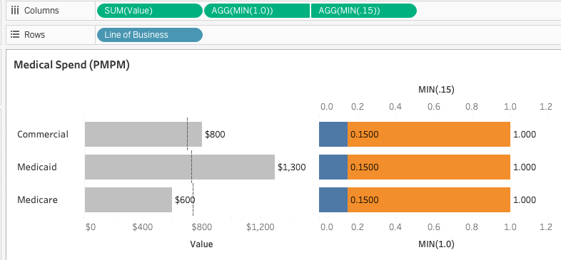
Create a “Difference Flag” with SIGN([Difference]) where “Difference” is the difference between your value and the target. Remove the Measure Names pill from color and place that new Difference Flag calculation on color, change to discrete. Change the color opacity to 20%.
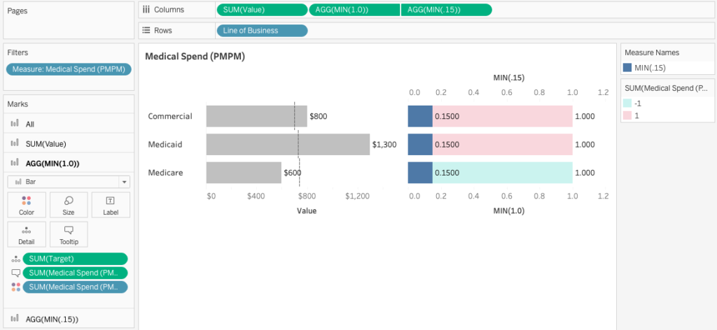
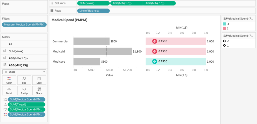
Similarly, remove the Measure Names pill from the second axis’s mark card and replace it with the Difference Flag calculation set to discrete. Change this mark to a shape and drag Difference Flag onto shape, assigning the up and down arrows from the shape mark card.
Remove labels from the MIN(1.0) mark and put the Difference calculation on labels with color set to Match Mark Colors.
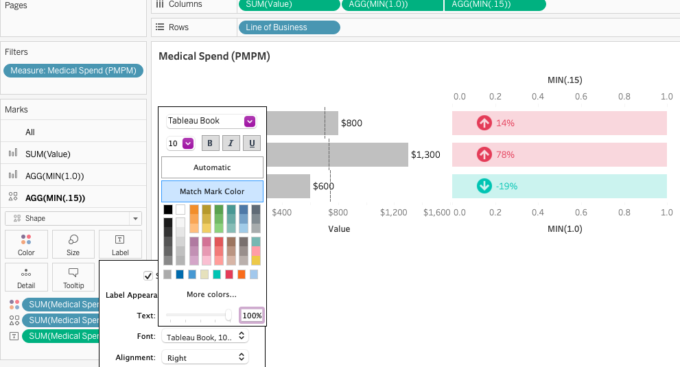
You can further adjust the labels with adding additional words and fields such as “vs. Target ($700)”. Depending on the size of the space allocated for the worksheet on the dashboard, you can adjust the axis and/or the placement of the shape to a different point along the axis.
Want More?
You can check out the fully downloadable dashboard on HealthDataViz’s Tableau Public page.
