
Constraints: Kryptonite or Door to Creative Innovation?
In my work creating data visualizations, I often hear designers complain that constraints are their kryptonite or, perhaps worse, a barbed wire prison fence around their creative freedom. But if we change our thinking, constraints can be the inspiration to break out of old habits, experiment, and try new things in search of innovative, workable solutions.
Data visualization designers and developer regularly face a few common design constraints including but not limited to:
- Client constraints
- Functional constraints
- Style constraints
Client Constraints
Clients and stakeholders impose constraints that inform a project’s scope and determine what can and cannot be achieved. These may be related to budget – “We only have the budget for one dashboard.” – or deadlines – “I have a board meeting at the end of the month and this dashboard is a top priority.”
Client constraints challenge us to prioritize our ideas, focus more directly on data visualization best practices, and identifying viable and accessible resources to achieve our designs. Without client constraints we are likely to spiral into a sea of endless possibilities – traveling down the rabbit-hole of dreaming up complicated, but likely unnecessary solutions, and miss the mark entirely.
It is of paramount importance that when faced with these types of constraints that we have a candid conversation with stakeholders about what can reasonably be achieved.
These conversations must be grounded in gathering information and requirements like:
- The purpose of the dashboard and the audience.
- A “one-and-done” display for a presentation
- A continually updated management tool
- A simple view for a busy executive with limited data expertise
- A customized report with deep analysis for a researcher
- Identifying the available data that is reliable and accessible.
- Determining “must have” versus “nice to have” elements like:
- Displays of complex vs. simple data analysis
- Limited vs. extensive functionality
When I had to create an infographic for Eating Disorder Awareness Month on a short timeline, I laid out all the possible aspects of a design that would add to my development time (data preparation, size and scope of the visualization, complexity of charts, overall story and depth, etc.) and carefully considered what was realistic and where could I cut time.

In the end I determined that to save time:
- The data source had to be easy to access and prepare, had a robust enough story, and required minimal manipulation.
- The physical size of my visual display needed to be fit into a small social media post (around 700 pixels square), and I had to keep the overall scope tight – focus on one point and one point only.
- The chart would need to be simple to build – meaning I shouldn’t have to learn a new technique or seek out special resources, such as shape files, while remaining impactful and eye-catching.
- The story had to be short and focused to be quickly interpreted in a social media post. I needed a clear title and minimal text, but just enough that the story of the data was clear.
Functional Constraints
Functional constraints can include technology, application, personal knowledge or abilities, usability, or format of the design or dashboard. There may be limitations on what a tool can do or your own abilities in using the tool. Other examples of functional limitations are resolution or size restrictions of a dashboard and specific accessibility requirements or ADA and WCAG2 compliance.
However, such constraints force designers to think of alternative solutions, opening the creative and innovative side of their brain.
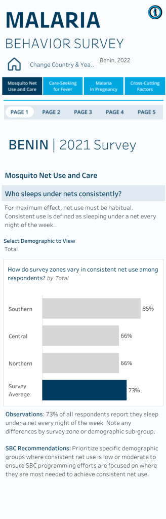
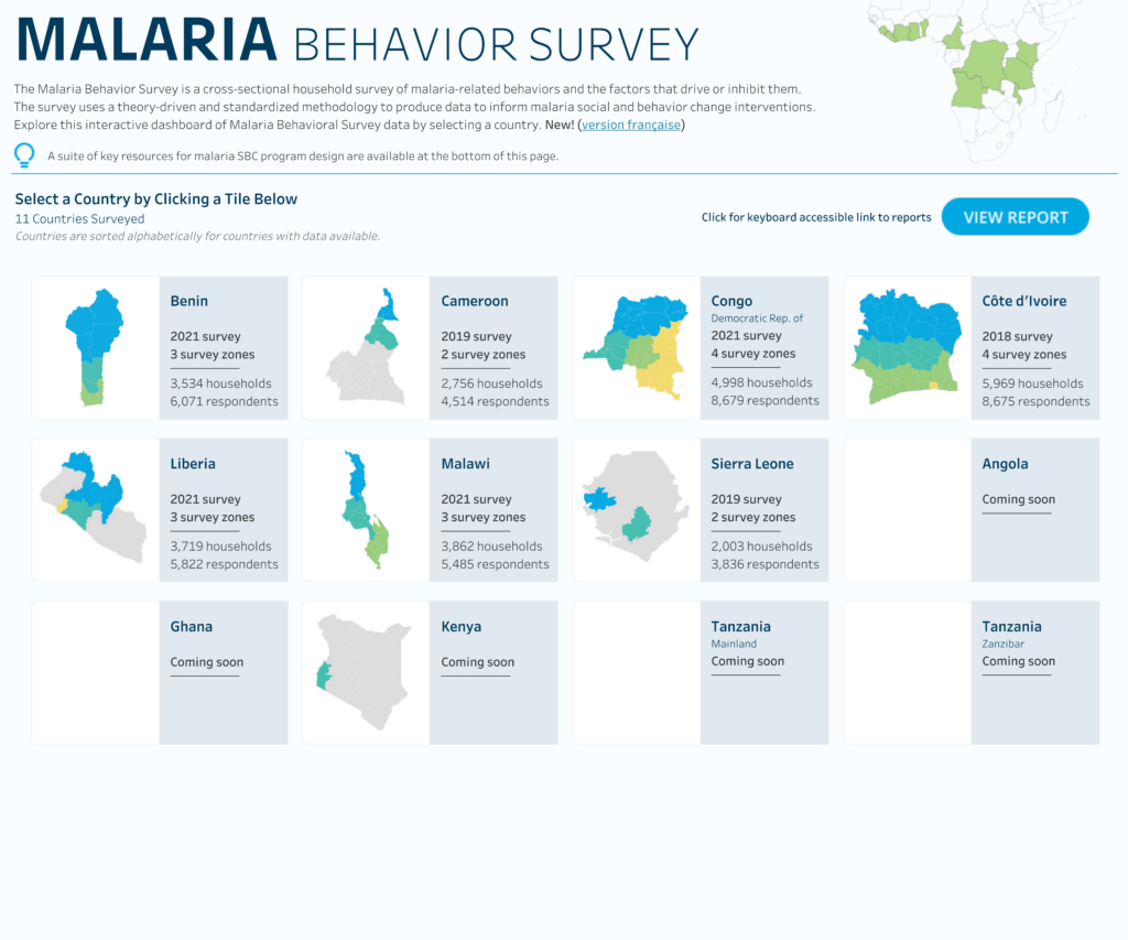
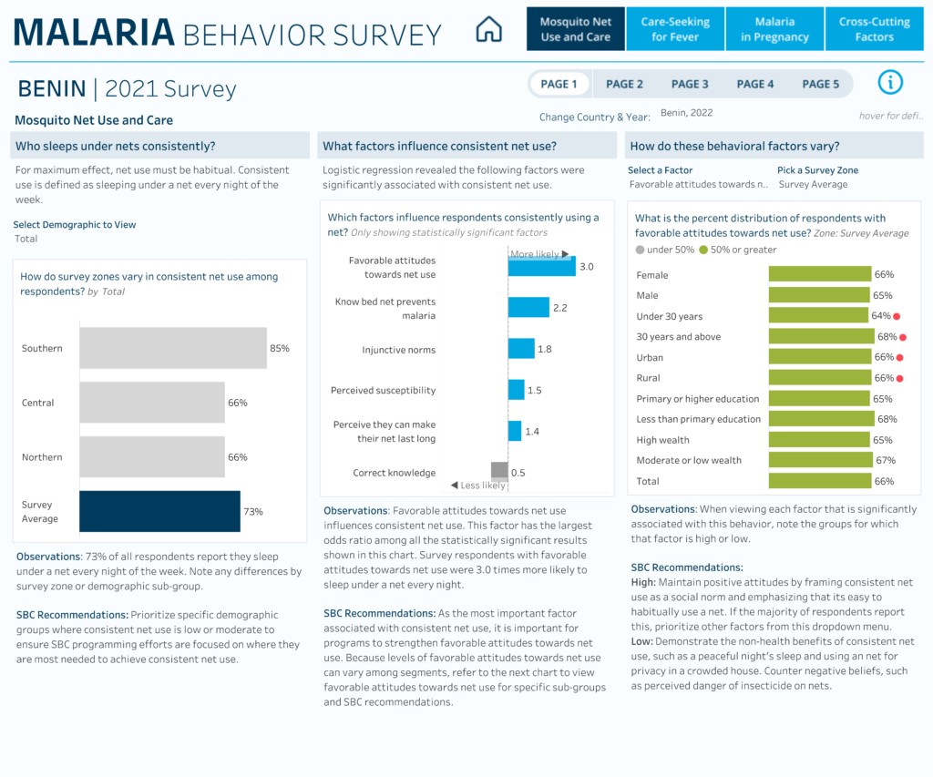
The primary constraint for the Johns Hopkins Malaria Behavior Survey shown below, was that the primary end users were located in various African countries and would typically access the dashboards via mobile devices.
A mobile-first approach forces designers to consider things like:
- The optimal use of every pixel for adequate visual spacing.
- Clear flow and stacking of visual elements and the impact of scrolling.
- Is each chart type appropriate for a phone (e.g. a wide table would not be ideal)?
- Users’ interaction with and interpretation of the data (e.g. how users will access details without a mouse for hovering over charts).
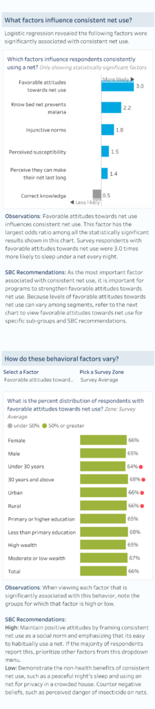
A designer must understand a tool’s functionality and its limitations to avoid designing something that isn’t possible to build. For example, Johns Hopkins required that dynamic key observation summaries and recommendations were available for each statistical analysis.
My original mobile prototype included a small button that would reveal a window with the required text or to minimize the length of the mobile view.
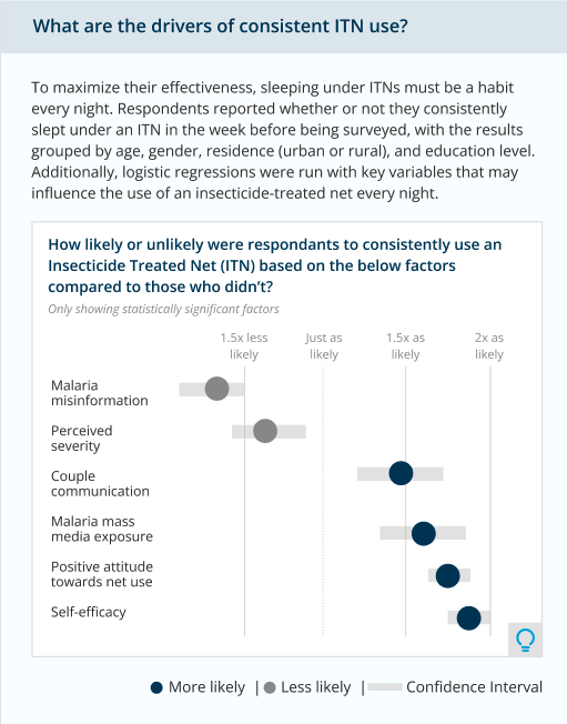
Yet, I realized that the approach would introduce other problems such as unpredictable placement of the pop-out window due to variations in mobile screen sizes and users might have difficulty finding and clicking the small icon for the text. As a result, I broke the mobile view into multiple pages to allow for the text to always be visible, limiting each view to three (3) charts and corresponding summary text.
Knowing an application’s capabilities and limitations provide necessary design constraints, but more importantly, provided the creative fuel to challenge my designs.
The final desktop views reflected the mobile-first design and maintained the same overall structure and organization.
Style Constraints
Style constraints are limitations or requirements around typography (font size and weight), padding and margins, icons and logos, brand colors, charts and graph requirements, and overall layout, organization, and dashboard size.
Most organizations have brand toolkits with at least a primary color palette, often consisting of only the brand’s logo colors. However, because I look at colors through the lens of data visualization best practices, I often find that the only colors given to work with are either too intense for the charts I’m building or are not visually pleasing together in the data displays I create.
Because graphic designers and communication teams are often not also data visualization experts, data viz designers are provided color palettes to use that may conflict with data viz best practices. For example, take United Healthcare’s brand colors – pretty in a logo and on a website, but slightly intense for a chart.
This style constraint (e.g., “Use only these brand colors.”) has opened creative doors for me as I’ve had to solve the problem of using bright, beautiful logo colors that are not ideal for a dashboard filled with charts and graphs.
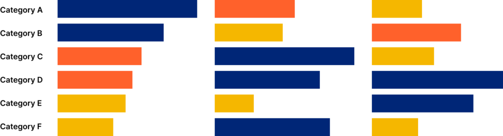
While developing a report for a client with bright and beautiful brand colors, it became clear that the colors were too saturated to use on the dashboard repeatedly. I brainstormed ways to mute the colors without compromising their brand or removing them entirely.
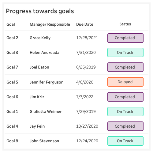
So, I embraced the constraint of color and devised a way to use shapes with an opaque fill and solid outline or stroke – something I hadn’t considered before I ran into this constraint. The resulting view had a softer feel and less overall ink without reducing the impact and insights the colors represented – which goals were delayed, at-risk, on track, or completed.
For more information on how to implement this technique, you can check out my original blog post about using opaque shapes in Tableau.
Creative Fuel
We can’t avoid design constraints in our work as data visualization designers and developers, but we can learn to channel them into creative fuel for developing new innovations and learning new skillsets. Limitations should not be your kryptonite. Instead, reframe how you think about them and use them as inspiration to imagine all the design possibilities.