
I use many workarounds to create complex and customized data visualizations in Tableau. One visualization that requires some “Tableau trickery,” as we like to say, is a table-like view where different chart types can be combined into columns. For example, the table may contain a column of text, a column showing shapes (such as up and down arrows), and a column with bar charts – all within a single worksheet.
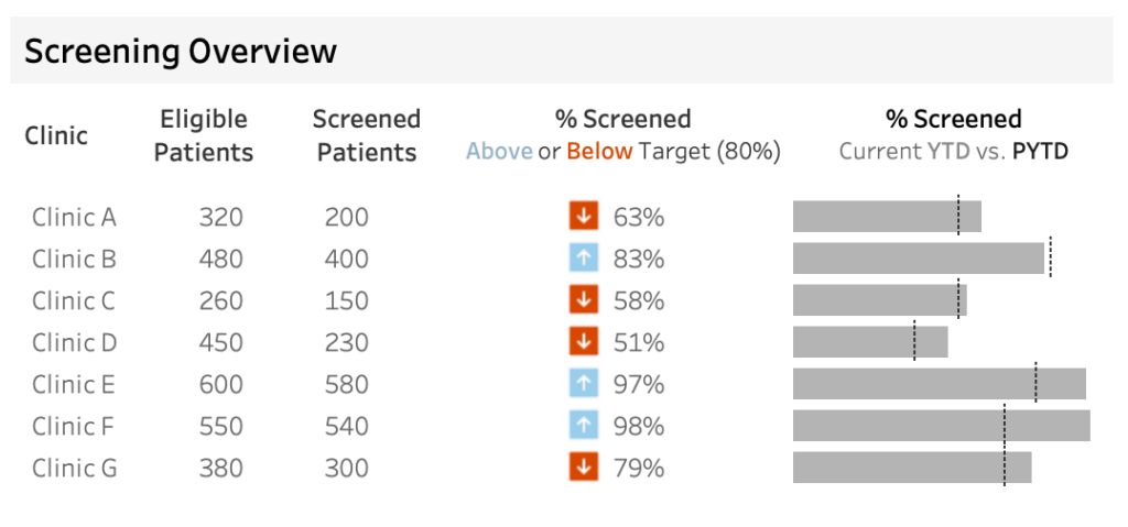
In the example below, I’ve created a table format showing patient screening data that contains the following:
- The name of each clinic.
- The number of eligible patients.
- The number of screened patients.
- The percentage screened with arrows indicates that it is above or below the target of screening 80% of patients.
- A bar chart that compares the current year-to-date (YTD) percent of patients screened (the gray bars) to the previous year-to-date (PYTD) percent of patients screened (the dotted reference lines).
I often use this chart structure because it eliminates the need for multiple worksheets placed next to one another, which can cause confusion as they don’t function as one unit. If a user decides to sort the data on one worksheet, the table’s rows no longer align with the other worksheets’ tables. The caveat to the “one-worksheet” table chart structure is that it’s not a native chart type in Tableau and requires some tricks to make it all work. (Be on the lookout for my next blog post on how to make this exact chart!)
Tableau must have recognized the need for developers to create a multi-chart table view, as they recently released the Tableau Table Viz Extension. This viz extension eliminates the need for hacky solutions to combine different chart types in a single worksheet. However, can it help me create the exact chart structure I’ve shared above? Let’s dive into what this extension can and cannot achieve.
Pros & Cons of the Table Viz Extension
PRO: Easily create a simple text table
The Table Viz extension makes it easy to combine different chart types and data, whether continuous or discrete, into a single table-like structure. Turning on this extension in the Marks Card allows me to easily drag all the data onto Details to begin building my chart. However, formatting has limitations.
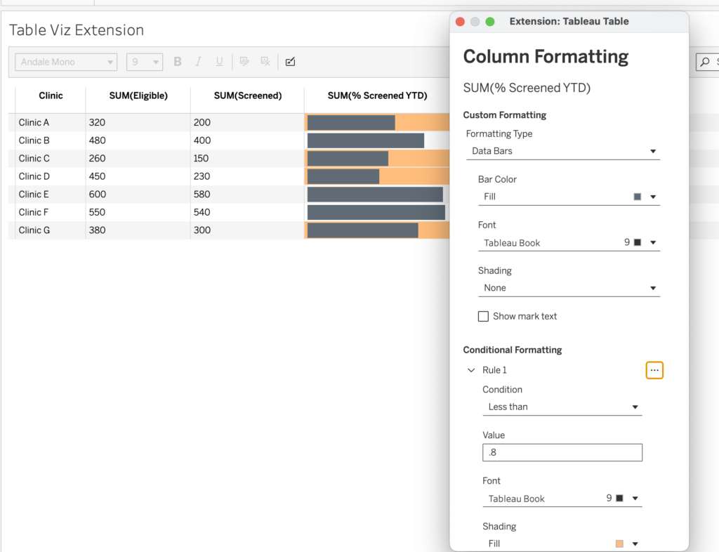
This Viz Extension only allows for text fields, a Color Scale, and bar charts. If I wanted to create something like my patient screening visualization shown in Figure 1 above, I’d be limited to only these features. I cannot use shapes or add reference lines to a bar chart, which is disappointing.
To highlight clinics where the percentage of patients screened is below a target of 80%, I could use the Color Scale option and apply conditional formatting rules. These rules would include values greater than 0.8 to be colored white and those less than 0.8 to be a light orange.
CON: Color scale rule limitations
Although this is a nice feature, I’m limited to creating a rule with a stagnant numeric value that can’t be dynamic. This can become an issue when, for example, if each of my clinics has a different target value. This is where the table viz extension falls short, as I can’t use a measure value of the target to set the rule of whether the percent of patients screened is above or below the clinic-specific target value.
CON: Cannot add reference lines to bar charts
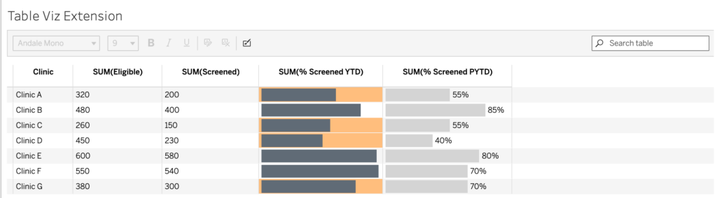
The next step to getting the Table Viz Extension to mimic the patient screening visualization is to compare the current year-to-date (YTD) percentage of patients screened to the prior year-to-date (PYTD). Although I can easily create a bar chart of the percent of patients screened YTD, the Table Viz Extension does not allow me to add reference lines for the PYTD. My only options are to bring in the PYTD screened patient data as text or a bar chart.
PRO: Can add conditional format bar chart highlighting
To get the most out of the Table Viz Extension, my approach to display the data must change to align with what the extension can do. I’ve removed the text color scale conditional formatting and changed the format to a bar chart. The table viz extension allows conditional formatting for the behind the bar chart. In the example below, I’ve created a rule highlighting the bars with a percentage of patients screened below the target of 80%.
To complete this table and include all the necessary data, I’ve added the PYTD percent of patients screened and formatted it as a bar chart for comparison.
Additional Formatting Options
PRO: Formatting Capabilities
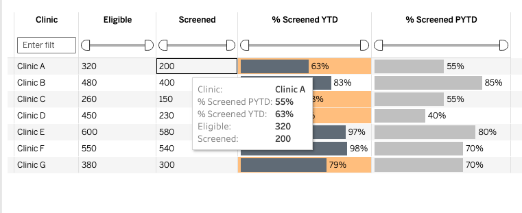
The Table Viz Extension allows you to easily edit the column names and apply the desired width for each column, both of which are not possible in my patient screening visualization. In my example, the measures will not have a column header due to the hacky method I have to use, and I cannot adjust the width of individual columns without affecting all the continuous measure columns with an axis in the table. For example, I’m unable to decrease the width of the column displaying the up and down arrows and the percentage of patients screened without also affecting the width of the corresponding bar chart.
One key feature of the Table Viz Extension is the ability to add or remove functionalities, like removing the toolbar or search bar, adding column filters, or showing the Excel download option. Column filters are helpful when creating a table with numerous rows since they allow users to filter directly from the table (like Excel). It’s also not uncommon for end users to want to download data directly from a data table. Enabling the Excel download feature is a slick way for users to easily download and access the data in the table for further analysis.
CON: Formatting Limitations
One of the best practices for data visualization I often reference is Edward Tufte’s data-to-ink ratio. The principle that states that the ink (color) should primarily be on the data itself and not elsewhere, causing unnecessary distractions. I rarely, if ever, use row banding to limit non-data ink. Unfortunately, it appears you cannot remove row banding with the table viz extension to reduce the unnecessary extra ink.
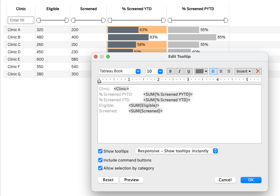
Lastly, I’ve found the Table Viz Extension’s tooltip capabilities odd. The tooltip is the same for every column in the table and cannot be edited individually. Ideally, I’d want a tooltip for each column rather than a tooltip listing the information of everything in the view. In my patient screening visualization, I can customize the tooltip for each measure value.
Final Thoughts
Overall, the Table Viz Extension provides excellent features for simple table structures, specifically the ease of building the table by simply turning on the extension and dragging the fields onto details in the marks card. Although the formatting is limited, it does contain some useful key features, such as the ability to adjust individual column widths, add column filters, and enable the download Excel button. Although this extension cannot replicate my more stylized patient screening visualization, I can now create interesting tables without bending backward using Tableau tricks. I believe the Table Viz Extension certainly can be a time saver and is likely helpful for many developers to achieve the needs of their end users.