
Category: Data Visualization
-

Accessible by Design: Making Data Visualization More Inclusive with Tableau
Published by
on
In a world where data guides our actions, dashboards are essential for decision-making. Yet, what if the visuals and tools we rely on to share this data aren’t accessible to all individuals? For example, imagine the challenges faced when the screen readers that some people depend on can’t read charts, when colors are indistinguishable for…
-
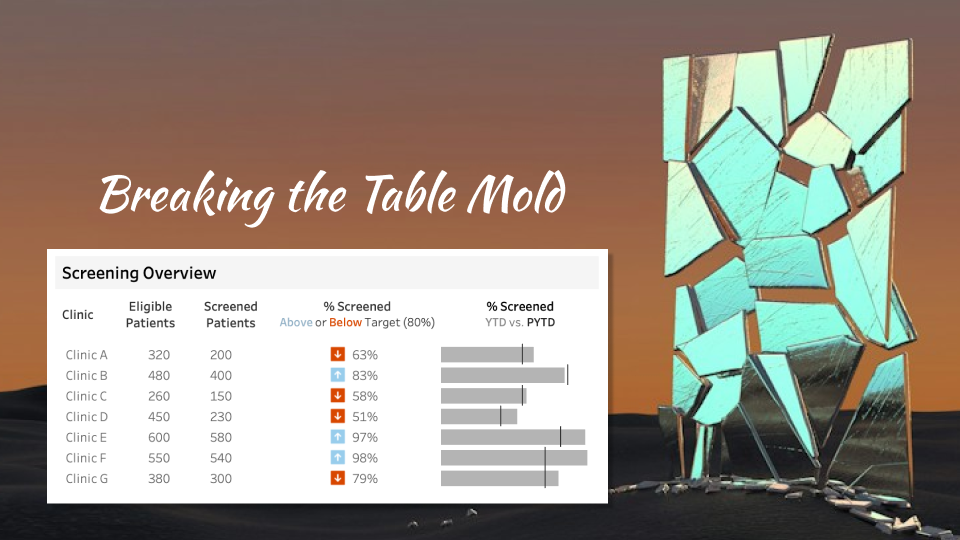
Create an Enhanced Tableau Table: Multi-Chart, One Worksheet Method
Published by
on
You may have seen my previous blog post, A Review: Tableau’s Table Viz Extension, in which I reviewed Tableau’s Table Viz Extension and listed its pros and cons (if you haven’t checked it out, please do!). I wanted to see if this extension could replace the ‘Tableau trickery’ I use when creating a customized table…
-

Alternatives to Stacked Bars
Published by
on
Stacked Bar Chart or Some Other Display? As with all charts, we need to think first about the different types and characteristics of the data we are working with before deciding on the most appropriate chart type. We can ask questions such as: What do we need to tell our viewers? Do we need them…
-

A Lesson from My Dog: Correlation vs. Causation
Published by
on
In 2022, my husband and I said goodbye to our beloved pup, Juno, and it was HARD. She was a great companion and inspired many past newsletters. Here is a perennial favorite tale. Was My Dog Stoned? I think my dog Juno got stoned at the park — again. On at least two previous occasions and…
-

Look Here! Effective Use of Icons
Published by
on
Cliffs and Bears… OH MY! This past August my husband Bret and I were hiking in Cape Breton Nova Scotia when we came upon the following signs: You might think this would cause me, someone who is wildly afraid of heights and hungry bears, to consider different vacation options, but when I saw these views,…