
You may have seen my previous blog post, A Review: Tableau’s Table Viz Extension, in which I reviewed Tableau’s Table Viz Extension and listed its pros and cons (if you haven’t checked it out, please do!). I wanted to see if this extension could replace the ‘Tableau trickery’ I use when creating a customized table that includes various visual types, such as discrete text, bar charts, and symbols, all within a single worksheet. The figure below shows an example of this ‘multi-chart table.’

The Table Viz Extension has some useful capabilities, but I couldn’t fully recreate the chart (Figure 1) using it.
The one-worksheet multi-chart table structure is not a native chart type in Tableau, but I often use it in my dashboards. This tablelike view allows me to share a lot of information in a single space, enabling users to sort any column while keeping all rows in alignment. This feature wouldn’t occur if each column of data were an individual worksheet. Users could only sort one column at a time, making the rows mismatch.
In this blog post, I’ll share how to create this table-like view to enhance further how you display your data.
How to Create the Tablelike View
Without using the Table Viz Extension, I’ll go through the steps to create a single worksheet tablelike view that includes three chart types to display screening rates at different medical clinics. The dummy dataset can be downloaded to follow along.
The goal is to display the following in a single worksheet:
- Clinic Name
- Number of eligible patients.
- Number of patients who are screened.
- The percentage of patients screened year-to-date (YTD) compared to an 80% target with colored symbols showing if the rate is above or below the target.
- A bar chart showing the percent of patients screened year-to-date, with a reference line displaying the percent of patients screened from the previous year to date.
Add Header Text
To create the first three columns of text, we will place each of these metrics onto the rows shelf as dimensions, resulting in a text header.
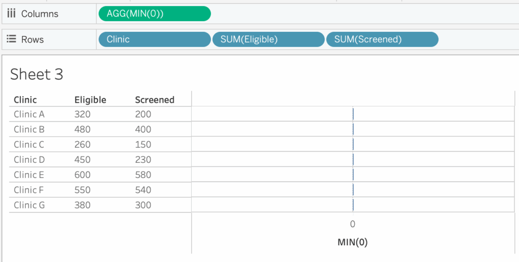
- Drag the dimension ‘Clinic’ onto the rows shelf, followed by the measures ‘Eligible’ and ‘Screened.’
- Right-click or click on the drop-down caret on both the ‘Eligible’ and ‘Screened’ pills and select ‘Discrete.’ Notice how the pills turn green to blue, indicating that these fields are now utilized as dimensions.
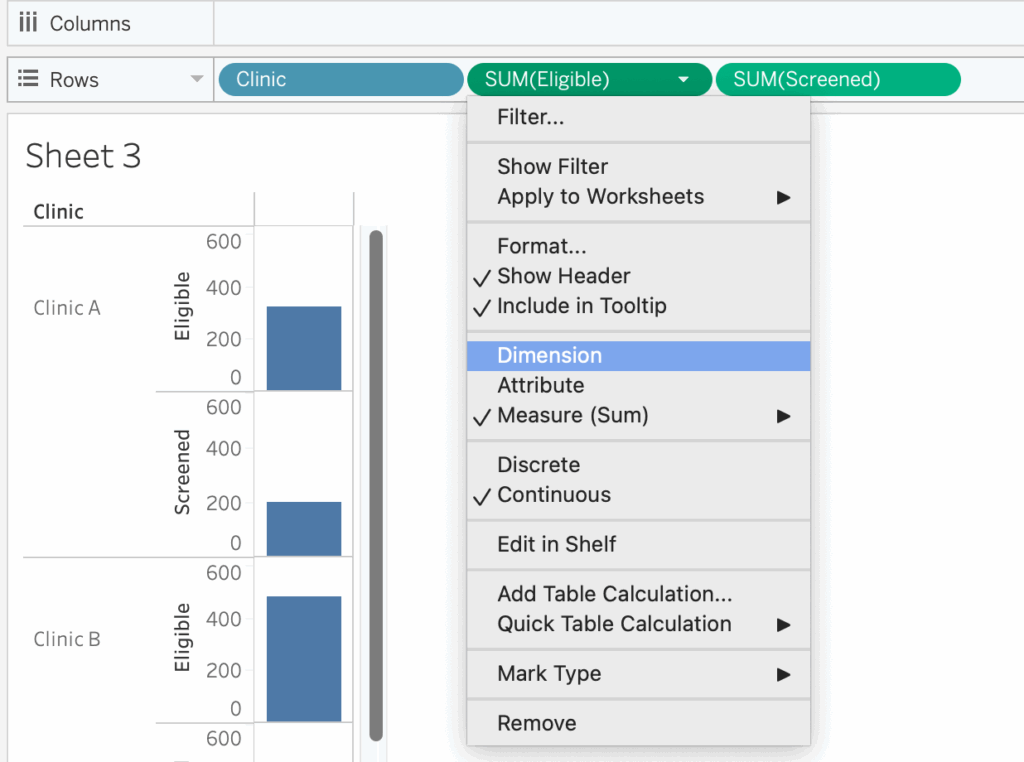
Using a Dummy Axis
The next few steps introduce the ‘Tableau trickery’ needed to create the tablelike view where we combine shapes and text in a single column and a bar chart. Tableau allows you to place multiple measures onto the column shelf, but continuous measures are displayed along an axis by default. In this example, we don’t need to visualize the value on an axis. However, we want the column to display each clinic’s value as text and the corresponding shape.
For example, placing the ‘% Screened YTD’ measure field onto the columns shelf creates a bar chart with an axis for the percent of patients screened for each clinic (the rows). Changing the mark type to ‘Shape’ will plot the shape on the continuous axis and won’t align the column of text and shape. The video example below shows how Tableau plots the shapes on the axis.
We will create a ‘dummy axis’ to achieve our design and place our measure as text on labels instead of as a field on the column shelf.
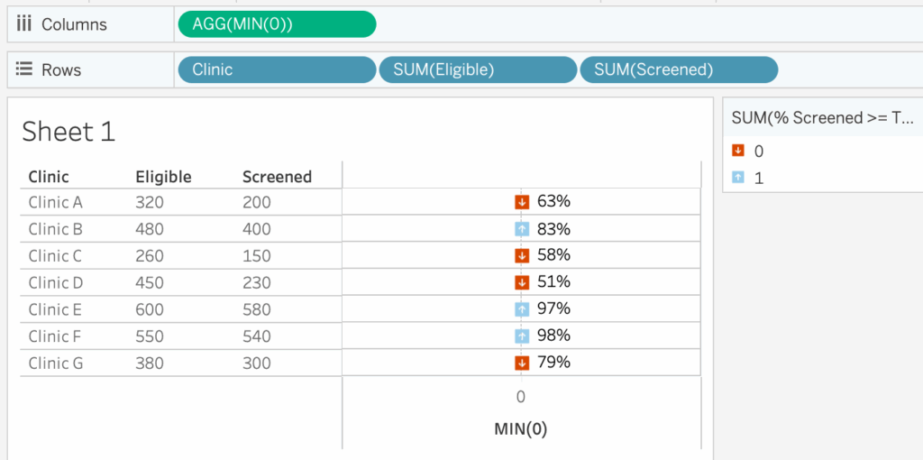
- To create the dummy axis, create an in-line calculated field by double-clicking the columns shelf and typing MIN(0). This creates a field that returns 0 for all rows within our data and displays a continuous axis that we can modify.
- Drag the field ‘% Screened YTD’ onto ‘Label’ in the Marks Card.
- On the Marks Card, select the drop-down caret and change the chart type to ‘Shape.’ Drag the field ‘Above or Below Target’ onto Shape on the Marks Card. If you’d like to create this calculation on your own, use the following syntax: IIF([% Screened YTD]>=0.8, 1, 0)
Adding Shapes and Labels
Format the data within this column.
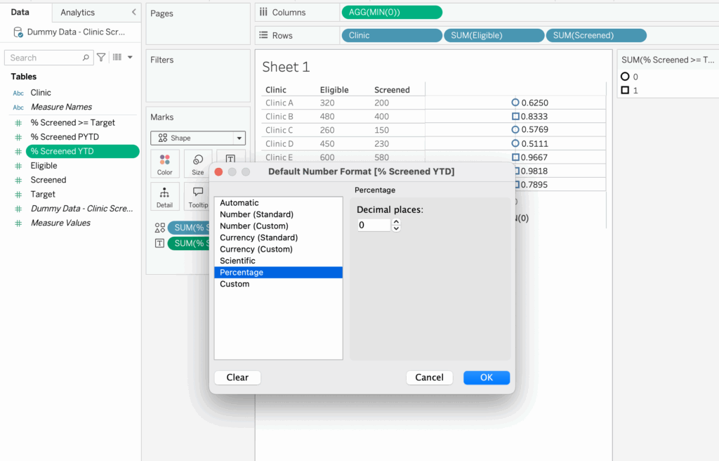
- Make the field ‘% Screened YTD’ a percent: Right-click on the field in the data pane > select ‘Default Properties’ > Number Format > in the menu, select ‘Percentage’ > decrease the decimal places to 0.
Next, change the symbols to up and down arrows. I created my own arrows using Figma and saved them in my Tableau Repository Shapes Folder. For the exercise, select from the default shapes.
- Ensure that values of 1 are an upward-facing arrow and values of 0 are a downward-facing arrow.
- Increase the size of the arrow shapes by clicking on ‘Size’ in the Marks Card and dragging the slider to the right until you receive the desired size. Your chart should look similar to Figure 7 below.
Create the Bar Chart
Now let’s add the percent of patients screened YTD vs. PYTD bar chart.
- Drag the ‘% Screened YTD’ field onto the columns shelf to the right of MIN(0).
Tableau assumes we want to keep such formatting throughout since we’ve made some previous formatting edits to the MIN(0) data. We will make sure this data is in a bar chart format.
- On the Marks Card, click on the tab SUM(% Screened YTD), then click the drop-down to select the Bar chart type.
- Click on Color in the Marks card and select a lightish gray color so as not to distract from the up and down arrows.
- Remove both pills from the Marks Card for a clean slate.
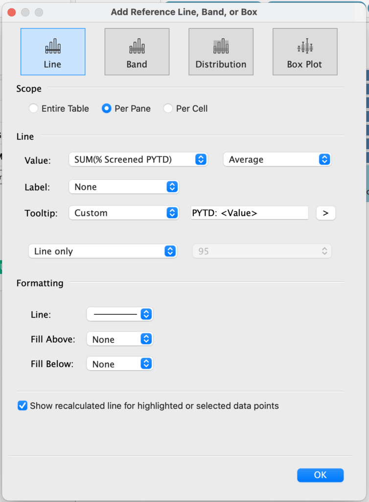
Add a Reference Line
Add a comparison reference line to the bar chart for the percentage of patients screened from the previous year to date.
- Drag the field ‘% Screened PYTD’ onto Details of the Marks card for the bar chart, the tab for SUM([% Screened YTD]).
- Right-click the SUM([% Screened YTD]) axis and select Add Reference Line.
- In the Add Reference Line Dialogue box, make the following selections within the ‘Line’ option:
- Value: SUM([% Screened PYTD])
- Label: None
- Tooltip: Select ‘Custom’ and type in the text box ‘PYTD: ‘ then click the right caret and select ‘Value.’
- Formatting: Click the drop-down arrow next to Line, select a thin line, and increase the opacity to 100%
Format the Final Chart
Let’s wrap up additional formatting to remove any non-data ink.
- Remove the zero line for the percent screened above or below the target column. Right-click the MIN(0) axis > Format > click on Lines > Click the menu for Zero Line > select ‘None.’
- Remove the column grid line. While still in the Format Lines menu, Click on Columns tab > click the drop-down menu for Grid Lines > select None.
- Remove the column headers. Right-click on any of the axes > select Show Header to uncheck it.
- Remove all row and column dividers for a clean look.
Since we’ve removed the column headers, we can utilize text objects to create customized headers once we bring this worksheet onto a dashboard. Here is my finalized view:
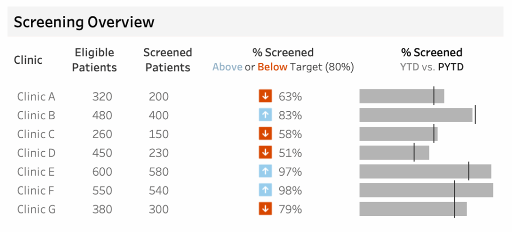
There you have it! A simple, clean, enhanced-looking table that provides us with quick-at-a-glance information to determine whether a clinic’s percent of patients screened is above or below the target of 80% and whether the percent screened from this year to date is above or below the previous year to date.
As I mentioned, this tablelike structure view is super helpful and is used in many dashboard designs. If you’re curious about what Tableau’s Table Viz extension can do with this data, check out my last blog post: A Review: Tableau’s Table Viz Extension.
For another example of using a combination of shapes and bar charts, check out Tableau Visionary Hall of Fame Lindsay Betzendahl’s post on ‘Clever Ways to Use Indicator Icons’.
Leave a Reply