
I’m sure most of us can name a memorable teacher — one who, for better or worse, made a lifelong impression upon us. Mine was the principal of my junior high school. I remember him in part because we had the same last name; but I suppose that’s not so unusual, given that he was my father.
Yes, I was the Principal’s Daughter (or, as my classmates called me, “the P.D.”) and contrary to what you might think, I loved it. My dad was admired and respected by teachers and students alike, and I was proud to be his daughter. I also loved being the P.D. because he was readily available to me when I needed him.
For example, one time when I was sick I knew that if I just skipped the school nurse and went straight to him, that he would send me home. A big perk of being “the P.D.”…except…he wouldn’t let me go home… that is, until I literally threw up on his shoes. In retrospect I suppose our unique relation required me to provide him with irrefutable evidence.
An orderly man, he approached things in a logical, methodical way. Consider the fact that we always had graph paper in our house, and he always made me use it to do my math homework.
For instance: pull out a piece of paper and a pencil (no calculators allowed!), and add the following numbers: 149 + 6731 + 12900 + 17.
Now can you guess why he made me use graph paper? Take a look:
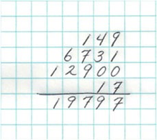
Graph paper provides a structure for making certain that the numbers are aligned correctly. The thousands are in the correct column, and so are the hundreds, tens, and ones. This order and symmetry reinforce one of the first concepts we learn in arithmetic: that our system of enumeration and calculation is based on tens; and that we must keep the ones with the ones, the tens with tens, the hundreds with hundreds, and so on.
Now think about the display of data in tables.
What is wrong with this table of data I found at www.hcahpsonline.org?
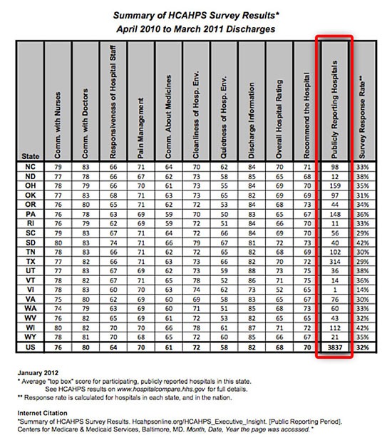
Although virtually all of the numbers align in the first section of columns (where the state abbreviations are listed on the left) — only because most of them happen to have two digits — you can see that in the highlighted column, the numbers aren’t in alignment.
Misaligned numbers are hard to read, understand, and compare. This confusion creates the very real possibility that those who use your table will misread the values. Misread values lead to incorrect decisions — which can lead to disastrous results.
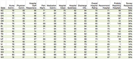
One of the fundamental best practices of table design is based in elementary arithmetic: numbers should be right-justified to ensure that their values are aligned correctly.
Lab values, pharmacy data, clinical performance measures: a whole lot can go wrong if values are read incorrectly — and that can happen simply because the data is not in alignment!
Please don’t say, “but it looks better when the numbers are centered.” Nonsense. Tables look good when they are designed correctly: clear, orderly, accurate; easy to read, easy to interpret.
When I think back to this simple lesson about correct alignment, learned while I did my math homework at the kitchen table, I am amazed at how it has stayed with me, informing the work I do to this very day. That is the legacy of a great teacher.
Leave a Reply