
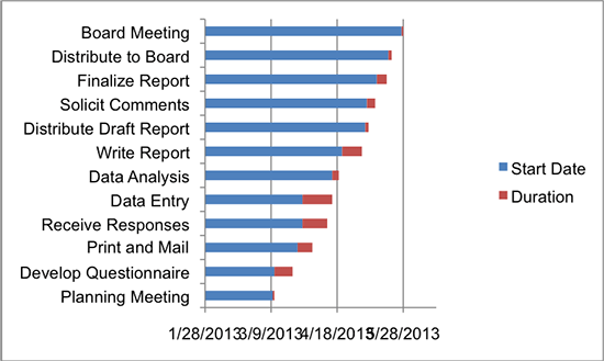
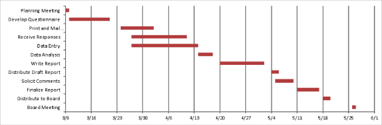
A Gantt chart is a horizontal bar chart often used in project management applications.
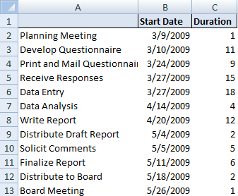
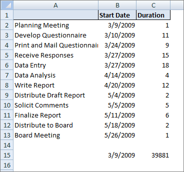
The attached Excel workbook shows a Gantt chart set up to depict the schedule for a project in cell range A1: C13. The horizontal axis represents the total time of the project, and each bar represents a project task. This graphical representation can help viewers quickly see the duration for each task and identify the overlapping tasks.
Step 1. Highlight the range A1:C13 click on “Insert” tab. Select “Bar Chart” then select 2D “Stacked Bar” chart.
Step 2. Delete the legend.
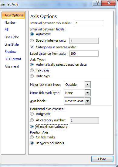
Step 3. Right click on vertical axis and select “Format Axis”. Select “Axis Options” and click on “Categories in reverse order”. Under “Horizontal Axis Crosses at” select “At maximum category” to display dates at the bottom. Click ‘Close’.
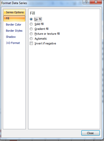
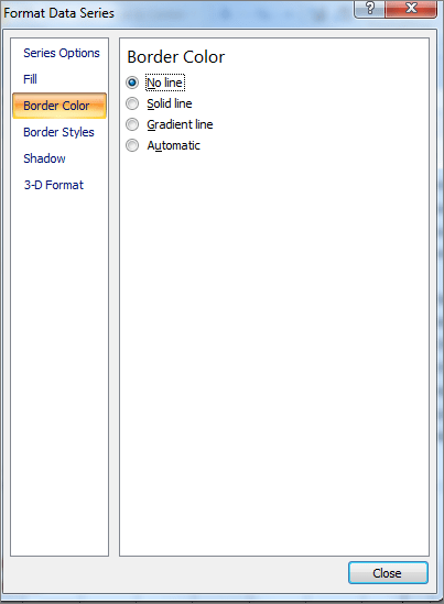
Step 4. Right click on the “Blue” portion on the boxes and select “Format Data Series”. Click on “Fill” tab on the left hand side of the box and select “No Fill”.
Step 5. Click on “Border Color” tab and select “No Line”.

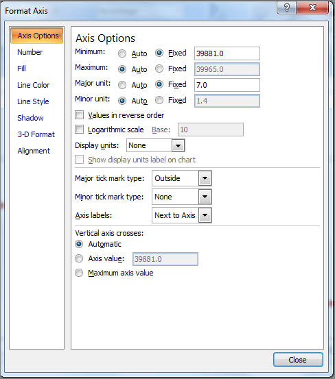
Step 6. Right click on horizontal axis and select “Format Axis”. Select the “Axis Options” tab and adjust the Minimum settings to accommodate the dates you want to display. For this step you must enter the values as date serial numbers, not actual dates. In order to determine the serial number type the date into a cell in Excel and format the cell using “General” number format. See Excel workbook cell C15.
Select “Fixed” under minimum and type the number 39881 for the date 3/9/2009 in the cell. Select “Fixed” under major unit and type the number 7 in the cell to display one-week intervals.
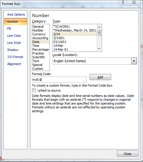
Click on “Number” on the left hand side of the “Format Axis” pop up box and select “3/14”. Click “Close”.
Learn more about Gantt Charts in my May 17, 2013 newsletter “Visualize a New Approach“.
Leave a Reply