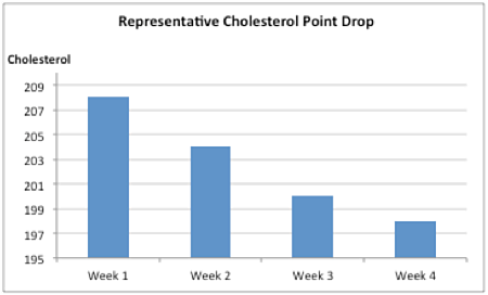
As I was cooking a batch of oatmeal this morning I got to thinking about a graph that Quaker Oats published a few years ago that raised the ire (rightly so) of several groups. This is what it looked like (I have reproduced the graph after this photo so that you can see it better):


It would appear that oatmeal is pretty powerful stuff.
Except that is when you display the data correctly…

So, here is the rule for displaying data correctly when you use a bar graph… you must always start at zero “0.” This is true for both vertical and horizontal bars. As you can see, failure to adhere to this rule can significantly change the message in your data.
Oh… and it can even get you threatened with a lawsuit just like Quaker Oats was. Don’t believe me? Read about it by clicking here.

Leave a Reply