
About four years ago I discovered the “TED” (Technology, Entertainment and Design) Talks, and got so hooked on them that my family staged an intervention. Had you looked up “mesmerized” in the dictionary back then, you would have found a picture of me staring at the computer screen in my p.j.’s and fuzzy slippers, empty food containers strewn about (I kid you not).
Here’s a brief statement from TED’s website, for those who aren’t familiar with the Talks: “TED is a nonprofit devoted to spreading ideas, usually in the form of short, powerful talks (18 minutes or less). TED began in 1984 as a conference where Technology, Entertainment and Design converged, and today covers almost all topics — from science to business to global issues
— in more than 100 languages.”
I am in recovery from my binge-watching days and can now (almost) safely watch a single talk, as I did last night. As many of the TED Talks do, this one completely blew me away. Artist Neil Harbisson spoke on “What’s It Like to Hear Color?” Harbisson was born with a rare visual condition called a chromatopsia — total color blindness. He’s never seen color, and doesn’t know what it looks like; he comes from a grayscale world. To Neil, the sky is always gray, flowers are always gray, and television is still in black and white.
Here’s the really cool thing, though: since the age of 21, he has been able to hear what he can’t see. In 2003, he started a project with computer scientist Adam Montandon, who created an electronic eye with a color sensor that detects the color frequency in front of Neil and sends this frequency to a chip installed at the back of his head. This chip allows him to hear the color through bone conduction. Here is a bit of how Neil explained the experience in his talk:
“[L]ife has changed dramatically since I hear color, because color is almost everywhere, so the biggest change for example is going to an art gallery; I can listen to a Picasso, for example. So it’s like I’m going to a concert hall, because I can listen to the paintings. And supermarkets, I find this is very shocking; it’s very, very attractive to walk through a supermarket. It’s like going to a nightclub. It’s full of different melodies. Yeah. Especially the aisle with cleaning products. It’s just fabulous.”
You can hear Neil’s entire talk here.
Stretching our sensory perception with new technology like this is nothing short of astonishing.
The story got me to wondering about what some of the data visualizations that I encounter in my work might sound like. (I covered my ears to muffle the din of that idea!) Imagining the sound of color in reports and dashboards sent me back to a few of the best practices of using color to display information. Here they are again with links to my original posts.
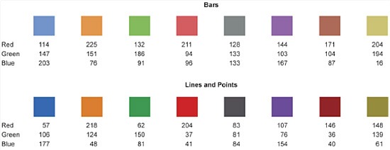
- Optimal Colors for Graphs. There’s an interesting (and growing) body of research about color: what we see, how we see it, how we understand it, how it affects us. I wrote for example about Maureen Stone of StoneSoup Consulting, an expert in color for data visualization, who put together some shades that work really well for displaying data in graphs.
 Here’s the link to my original post: Optimal Colors for Graphs.
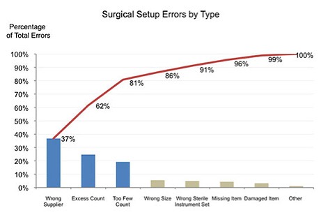
- Color to Encode and Highlight Differences. Never use color in your data displays merely because you want them to look bright and eye-catching, or to entertain and dazzle your viewers. Color in healthcare data displays should serve to encode contrast, change, or differences in meaning.Note how, in the Pareto Chart below, color makes the 80/20 Rule really stand out. (That is, that 20% of our causes-which jump out thanks to the “vital few” blue bars-will very likely produce 80% of our results.)
 Here are the links to my original posts on this topic:
- Red, Yellow, Green Are So Last Year (And we can and must do better!). Did you know that approximately 10% of all men and 1% of all women are color-blind? Sad, but true: where most of us see this:
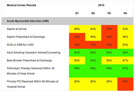 10% of men and 1% of women will see only this:
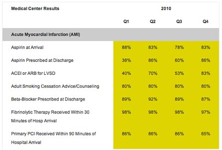
Here are a few simple, effective ways to flag important data (without resorting to stop-light colors):
- Group it under clear, sensible headers: “Needs Improvement,” “Meets or Exceeds Goal”
- Use text enhancements (sparingly!) to italicize or bold important and interesting data
- Use soft hues to make areas stand out even if your viewer can’t distinguish red and green
- Add sharp, simple borders or shading to corral data into groups worthy of attention
See more here: Red, Yellow, Green is SO Last Season.
At first my heart ached when I heard Neil Harbisson talk about living in a black and white world, but as I learned how technology allowed him to hear color, I was awed, amazed, and finally inspired. I was reminded that effective use of color has the power to convey the important messages in our healthcare data so that we can improve our systems (and with them, patient care). And that, my friends, makes beautiful music.
Leave a Reply