
It’s estimated that our brain receives approximately 40 million sensory inputs every second, most of them through our eyes, and tries to make sense of them all–something my brain does far better after several cups of morning java or Red Bull (yes, I still drink the stuff, and I like it).
In order to make immediate sense of inputs, and of the rest of the world, our brains create shortcuts. Each is a sort of “rule of thumb” based on previous experience to help make educated guesses about what is being experienced.
Most of the time this works pretty well — but not always.
Consider the example of the Kanizsa triangle, named for the Italian psychologist Gaetano Kanizsa, who developed it in 1955.
What do you see?

At first you probably see a triangle with a black border (in the background), and an upside-down, white triangle on top of it. But the white triangle doesn’t really exist: there are only partial circles and lines.
Your brain creates the shape of the upside-down triangle from empty space, because that is what it expects to “see.”
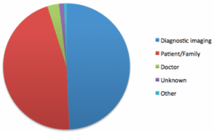
Which brings me to the topic of pie charts (yes, again). I have recently been struck by people’s insistence that when you use a pie chart to display part-to-whole data, you KNOW that the parts of that chart add up to 100%. Using my preferred method of data display, a bar chart, does NOT, these folks claim, afford this same certainty.
Oh, how I love a challenge.
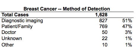
Consider the following table of data:
The same data in a pie chart:
Let’s look at the table again, but this time note that I have added a line that displays the total of the categorized cases (numerators), so that it can be set against the Total Cases amount of 1,628 (denominator) that is used to calculate the category percentages graphed above.
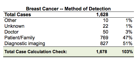
Comparing the two case totals reveals a difference of 50 cases, resulting in an incorrect percentage total of 103. That is, the parts as displayed are greater than the reported whole of 1,628 cases.
This error wasn’t caught because when people see a pie chart, they assume its segments total 100%. If however I display the data in a bar chart, for example, people don’t jump to this conclusion.
I don’t really know why this is. Maybe their brains create a shortcut based on their experience of seeing real baked pies, a shortcut that says, “There can be only one pie in a pie pan.” Perhaps it’s that every round object they’ve ever encountered–a baseball, a Frisbee, coins, or CDs (remember those?)–feels complete. You never see 110% of a baseball (unless of course you’ve consumed copious amounts of beer at a Red Sox game…but I digress).
Here’s what this common and misleading “brain shortcut” can teach us. As I wrote last month in “Channel Your Inner Sprout,” you must always–before doing anything else–make certain that your underlying data reconcile and make sense. Just because you can create a graph (any graph) doesn’t mean that the underlying data add up or are correct. And the pie chart in particular has a tendency to mask incorrect data–just one more reason why I dislike it so much (as if I needed another reason).
Remember: our brains create a truth for us that isn’t necessarily what our eyes are bringing in. What you see is truly–far more often than we’d like to believe–not what you get.
Leave a Reply