
topic: Tableau
-

Five Ways to Make Tableau Dashboards Run Faster (Part 1: Data and Query Tips)
Published by
on
We’ve all been there. You set out to build what you thought would be a great Tableau dashboard. When it’s all done, you realize the filter selections are lagging, charts are taking forever to load, and users are asking you what’s wrong with their report. Slow dashboards don’t just frustrate people; they also slow down…
-

Tableau’s Custom Views vs. Power BI Bookmarks
Published by
on
Discovering Power BI’s Bookmarks: A Journey from Tableau to Power BI Over the past year, I’ve been learning how to use Power BI. After years of working with Tableau as my data visualization tool of choice and using other software only when necessary, I decided to explore another BI platform more thoroughly. Learning another tool…
-

Accessible by Design: Making Data Visualization More Inclusive with Tableau
Published by
on
In a world where data guides our actions, dashboards are essential for decision-making. Yet, what if the visuals and tools we rely on to share this data aren’t accessible to all individuals? For example, imagine the challenges faced when the screen readers that some people depend on can’t read charts, when colors are indistinguishable for…
-

Managing Dashboard Date Filters
Published by
on
It is essential, in any dashboard build, to decide how to handle dates. How dates are formatted, displayed, and aggregated determines the charts that will be used, the comparisons that are involved, and the interpretation by end users. As developers, we must strike a balance between providing users with flexibility and guiding them directly to…
-

Using Images in Tableau: 4 Awesome Tricks
Published by
on
Tableau is a data visualization tool, and if you use it frequently, you are aware of its amazing strengths and occasional weaknesses. Tableau is not designed for image creation or, frankly, image use. Because of this, there are considerations and workarounds to ensure images maintain quality and are easy to use within Tableau. Remember, Tableau…
-

A Review: Tableau’s Table Viz Extension
Published by
on
I use many workarounds to create complex and customized data visualizations in Tableau. One visualization that requires some “Tableau trickery,” as we like to say, is a table-like view where different chart types can be combined into columns. For example, the table may contain a column of text, a column showing shapes (such as up…
-
Six Easy Tableau Formatting Tips to Save You Time
Published by
on
Tableau is an incredibly versatile tool for creating data visualizations that can bring your insights to life. However, how you format these visuals can affect how easily your audience understands and interacts with your data. Whether you’re just beginning your Tableau journey or a seasoned pro, mastering formatting is key to taking your projects to…
-
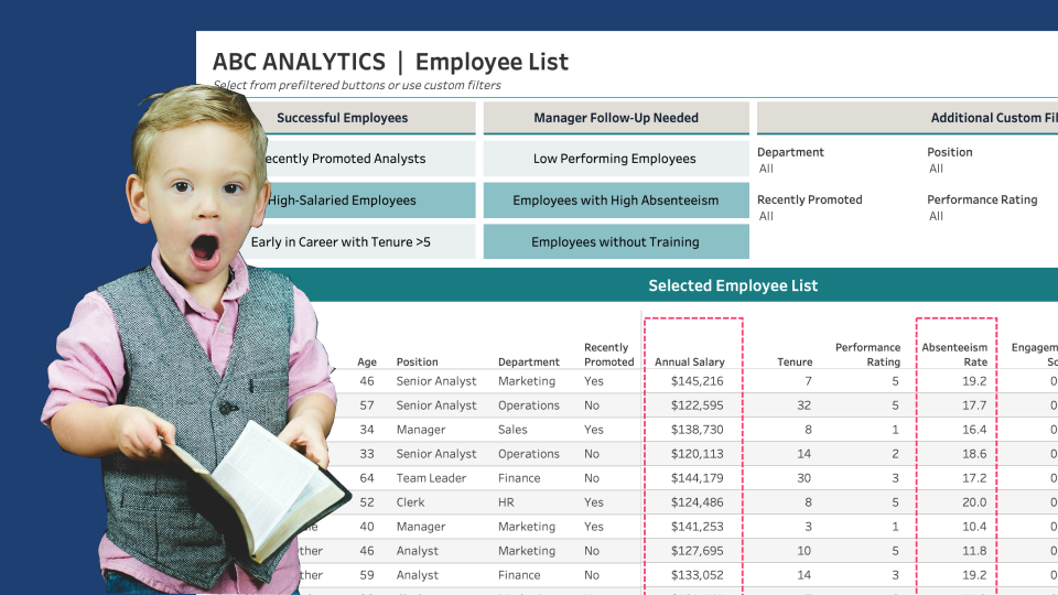
Custom Lists with Parameter-Driven Filter Buttons
Published by
on
Throughout my years working in data visualization, I have experienced an intriguing evolution. When I started using Tableau 10 years ago, I was interested in two vastly different ends of the spectrum of data visualizations: foundational concepts, such as building a bar chart and calculating aggregations accurately, and impractical concepts, such as creating a radial…
-

Create a Reset Button for Dashboard Filters & Sets
Published by
on
Let’s Start Fresh with a Reset! Filters in Tableau allow users to drill down to the data of interest. While this option makes data exploration fun, resetting multiple filters back to ‘All’ one-by-one can be time-consuming, primarily if numerous filters exist. A Reset button that with one click resets all filters and sets to “All”…
-

Improve the UX of Tableau Filter Selections with a Dynamic Error Message
Published by
on
Where Did the Data Go?!? In many scenarios, a dashboard displays a cascade of filter options to guide the user to a subset of data in the view. One issue with this method is when a user selects a final filter option (the child) and then selects something different from the previous option (the parent),…
-

Using Dynamic Zone Visibility to Enhance Dashboard Filter Options
Published by
on
We often see dashboards designed with numerous mechanisms to enable users to slice and dice the data any way they please, hoping these options guide them to crucial takeaways and information. However, providing an a la carte “slice and dice” dashboard often requires revealing all available filters and parameters. Yet, too many options can be…
-
Clever Ways to Use Indicator Icons
Published by
on
It’s not uncommon for me while designing a data visualization to wrestle with two, seemingly, competing priorities: successfully visualize all necessary data elements and charts on the dashboard and minimize the noise so the most important pieces of the data are easy to find. As Kathy Rowell, HDV Principal and Cofounder, mentions in her post…